
Lead with fit
Visitors should know who the service is for, what problem it solves, and what the next step requires before they reach the form.
The design faults that quietly reduce enquiries: unclear positioning, weak proof, hidden pricing context, slow templates, and high-friction forms.
Most conversion problems look visual at first, but the deeper issue is usually decision friction: visitors cannot understand fit, risk, cost, or next step quickly enough.
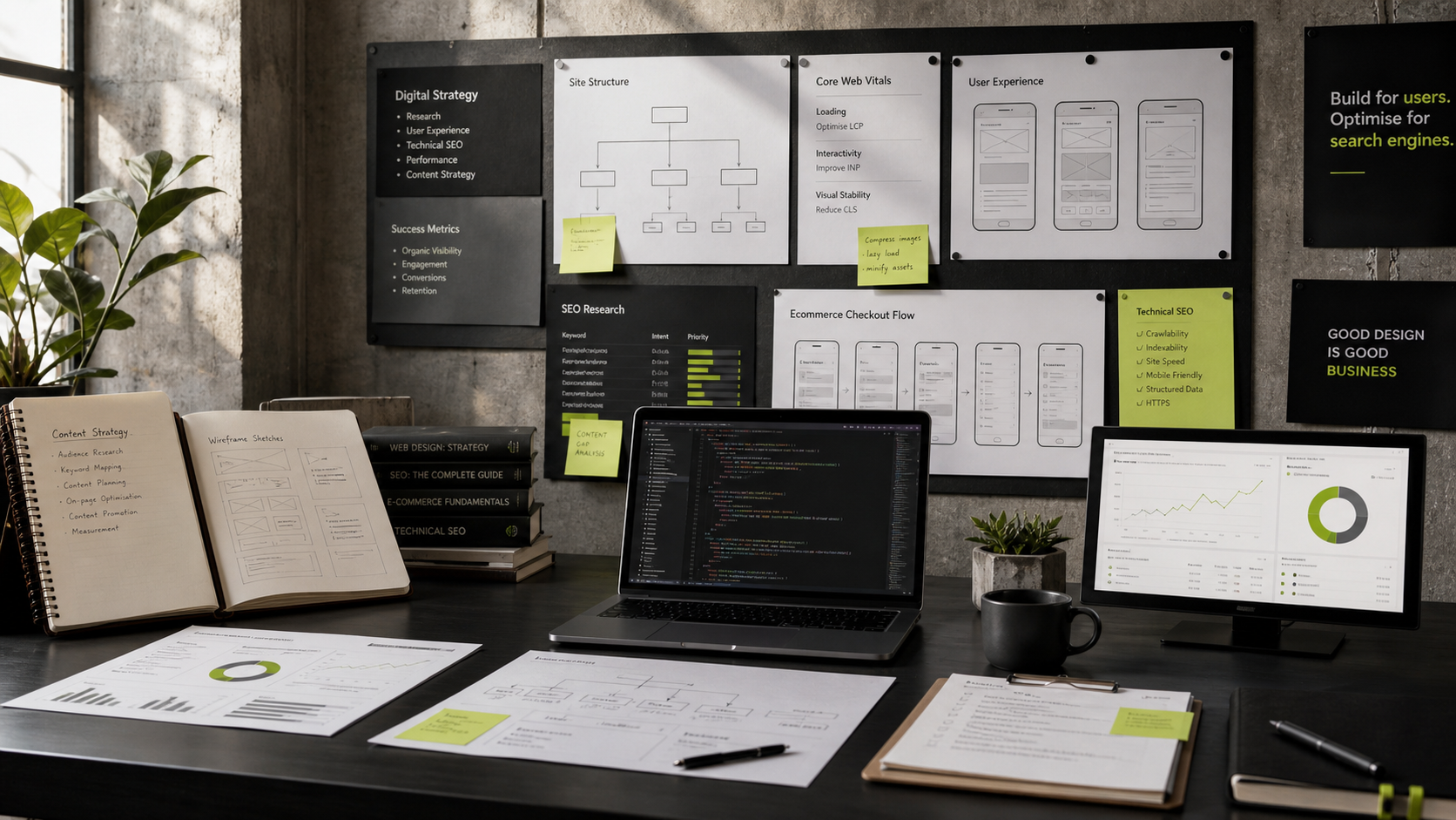
Use the order below before changing visual style. It keeps strategy, UX, SEO, and implementation tied to measurable work.
Visitors should know who the service is for, what problem it solves, and what the next step requires before they reach the form.
Add testimonials, case-study links, process detail, and service guarantees near CTAs, pricing sections, and contact forms.
Show expected response time, required fields, privacy context, and what happens after submission. Avoid unnecessary fields on first enquiry.
These references anchor the recommendations above. They are included so the article reads like a working note, not recycled marketing copy.
SEO Context
Conversion optimization starts with structure, not button color tweaks. Pages need narrative flow and decision support.
Position proof near objections, use concise value propositions, and minimize unnecessary interaction cost. This improves both lead quality and conversion rate.
- Lead with outcomes, not features
- Place trust signals before form CTAs
- Reduce form friction
- Test message hierarchy per segment
Update primary service and blog pages first, then roll patterns across supporting pages.
Use Search Console and analytics data to prioritize templates that impact leads fastest.
Review performance monthly and refresh copy where intent or SERP behavior changes.
Organic impressions and clicks for primary service queries
Qualified lead conversion rate by landing page
Engagement depth on page sections that handle objections
Foundational improvements often show movement within a few weeks, but durable ranking and lead quality gains typically compound over a 3-6 month window.
Start with high-intent service pages and technical blockers, then scale content and internal linking once conversion pathways are clear.
Ready when you are
Let us scope your next build.